

CSAT Dashboard
The CSAT (Customer Satisfaction) dashboard gives you a real-time view of how well the AI is handling customer conversations. Use it to monitor quality trends, identify problem areas, and track improvements over time.
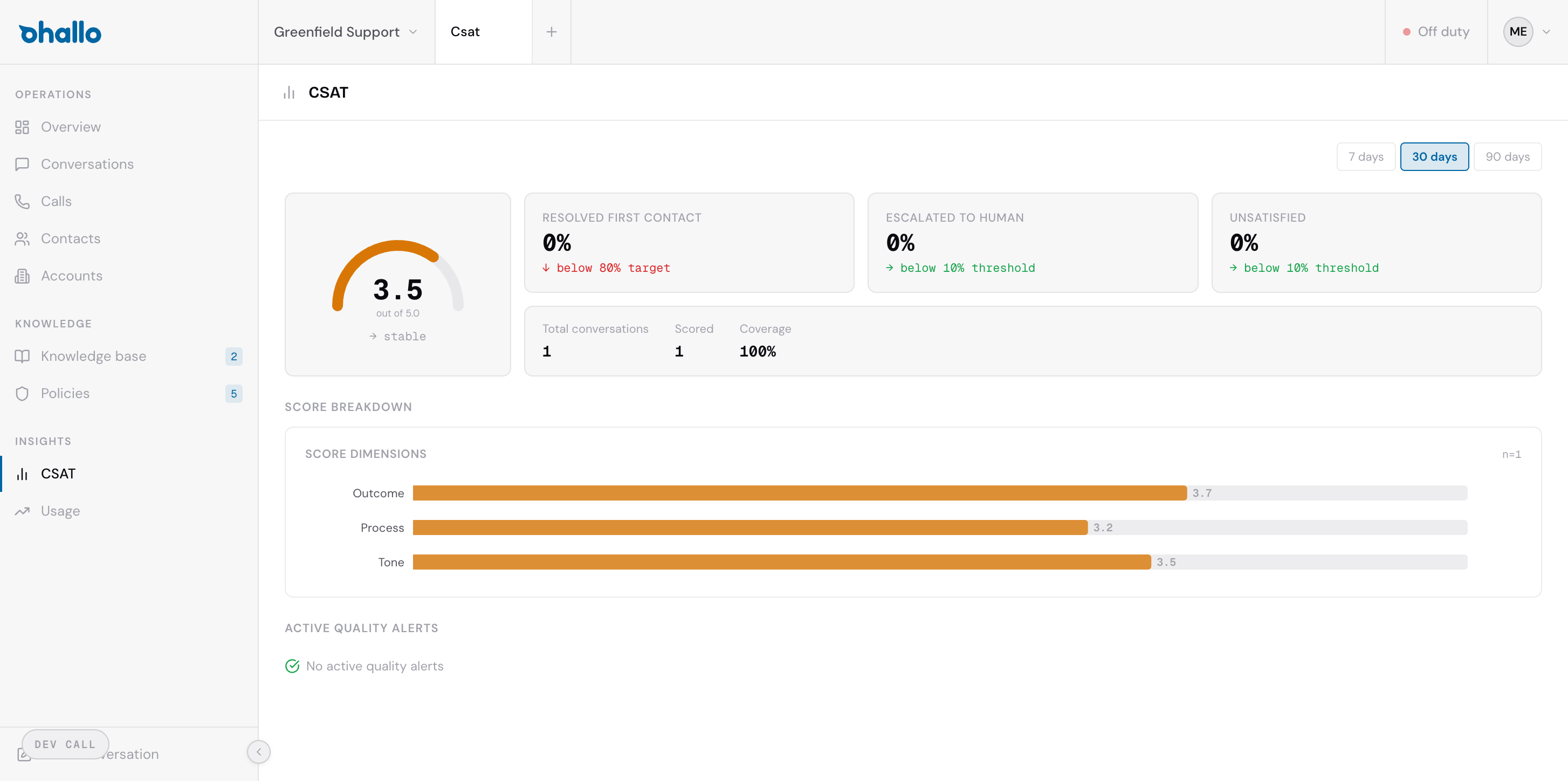
Overall satisfaction score
Section titled “Overall satisfaction score”The headline metric is the overall satisfaction score, displayed as a number out of 5.0. This is the average rating customers give after their conversation is resolved. A trend indicator next to the score shows whether satisfaction is improving or declining compared to the previous period.
Key metrics
Section titled “Key metrics”Below the overall score, you will find several key performance indicators:
| Metric | What it measures |
|---|---|
| Resolved first contact % | Percentage of conversations resolved by the AI without any human intervention |
| Escalated to human % | Percentage of conversations where the AI handed off to a human agent |
| Unsatisfied % | Percentage of customers who rated their experience poorly |
These metrics together paint a picture of how effectively the AI is operating. A high first-contact resolution rate with a low unsatisfied percentage indicates the AI is handling conversations well.
Score breakdown by dimension
Section titled “Score breakdown by dimension”Customer satisfaction is broken down into three dimensions, weighted by their impact on overall satisfaction:
- Outcome (50%) — Did the customer get the result they needed?
- Process (30%) — Was the interaction smooth and efficient?
- Environment (20%) — Was the communication channel and format appropriate for the situation?
This breakdown helps you pinpoint specific areas for improvement. For example, if the Outcome score is high but the Process score is low, customers are getting the right answers but finding the interaction cumbersome. Scores are measured relative to a baseline expectation — the disconfirmation score shows whether performance exceeded or fell short of expectations.
Period selector
Section titled “Period selector”Use the period selector at the top of the dashboard to view metrics over different time ranges:
- 7 days — A snapshot of recent performance
- 30 days — A monthly view for trend tracking
- 90 days — A quarterly perspective for strategic review
Switching periods updates all metrics and charts on the page.
Circuit breakers
Section titled “Circuit breakers”A circuit breaker fires when quality drops below thresholds repeatedly within a time window — for example, three or more low composite scores within 24 hours for the same scope. When active, the AI pauses autonomous handling for the affected scope and routes conversations to humans.
Each circuit breaker shows the scope it covers, when it triggered, and its current state. You can acknowledge it to indicate you are investigating, and resolve it to re-enable autonomous handling. Configure thresholds in CSAT Settings.
Account health
Section titled “Account health”Per-account quality tracking shows a rolling composite score (30-day average), trend direction, and a churn risk flag that activates after three or more consecutive low scores. Account health is also visible on individual account detail pages.
Coverage
Section titled “Coverage”At the bottom of the dashboard, you will see:
- Total conversations — The number of conversations in the selected period
- Scored conversations — How many of those received a CSAT rating
- Coverage % — The percentage of conversations that were scored
Higher coverage gives you more reliable data. If coverage is low, consider enabling CSAT follow-up emails in your workspace settings to collect more feedback.